
Playlist: Rocky McCulloch's Portfolio

Featured
99% Invisible #54- The Colour of Money (Director's Cut)
From Roman Mars | Part of the 99% Invisible (Director's Cut) series | 16:44
Australia made its money better. Why can't the US?
![]() [For Standard 4:30 version, go to: http://www.prx.org/pieces/84062-99-invisible-54-the-colour-of-money-standard-4]
[For Standard 4:30 version, go to: http://www.prx.org/pieces/84062-99-invisible-54-the-colour-of-money-standard-4]
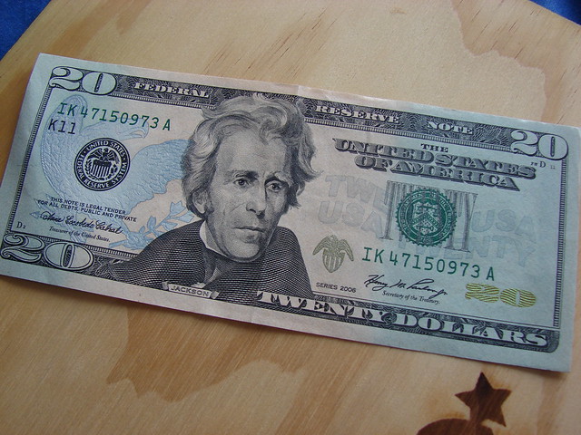
US paper currency is so ubiquitous that to really look at its graphic design with fresh eyes requires some deliberate and focused attention. So pull out a greenback from your wallet (or look at a picture online) and really take it in. All the fonts, the busy filigree, the micro patterns…it’s just dreadful.
Even though paper currency itself, just idea of money, is a massive, world changing technology, the look and feel of US paper money is very stagnant. Richard Smith is the founder of the Dollar ReDe$ign Project and in an article in the New York Times, he pointed out five major areas where the design of US currency could improve: color, size, functionality, composition, and symbolism.
The worst aspects of the design of the greenback are illustrated in this video by Blind Film Critic Tommy Edison.
It just so happens that Australian currency addresses each and every one of the points made by Richard Smith. Tristan Cooke and Tom Nelson of the blog Humans in Design are big fans of all the design innovations in Australian money. Aussie polymer notes are varied in color, get larger with each denomination, are more durable and are generally considered better and easier to use than US currency.

But there are some interesting reasons why the greenback is the way it is. David Wolman, author of The End of Money, explains that the legacy features that make US paper money look stale and anachronistic are meant to convey stability and timelessness. Since the US economy is so important in the world economy, why mess with it? Some fear that changing the design of the currency significantly (or eliminating the penny) could undermine the faith in the federal reserve note.
Even though Tristan and Tom are fans of the Australian polymer bills, they share Wolman’s view that the more interesting future innovations are not going to have anything to do with physical cash. Clever user interfaces that help us manage our money better, while providing even greater convenience, are getting more refined and accepted. So that ugly $20 in your wallet may never actually get prettier and more functional, it’ll just be gone.
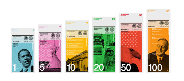
Extra: Below is the 2010 winner of Richard Smith’s Dollar ReDe$ign Project, submitted by Dowling Duncan.
Latitude News Podcast #3 - Black in China
From Latitude News | 13:14
Jo is African American. Jo lives in Yuyao, China. Jo gets a lot of attention.
- Playing
- Latitude News Podcast #3 - Black in China
- From
- Latitude News
 When Jo applied for jobs in China as an English teacher, she confronted signs reminiscent of the Jim Crow South: Whites Only, the school websites read. But her life-long fascination with Asian culture drove her past the signs - Jo quickly landed a job in the industrial city of Yuyao, where she was the only American. Five years later, Jo is married to a native Chinese, and she is the most recognizable face in Yuyao. This story recounts how Jo overcame institutionalized prejudice in China, and how she deals with the constant attention she receives because of her skin color.